
How to Use Color Spaces to Talk About Color
Our interaction with color is psychological. We recognize certain colors’ effects on human emotion and, conversely, we associate certain emotions with colors. As we’ve discovered colors in nature, we’ve named them. As our usefulness for color developed, those we created we also named. Since each individual has their own interpretation of color, using the conventional color names don’t always give us the best description. Only so many ways exist to accurately describe a color we see to each other.
Colorists interact with product designers and manufacturers to select the best colors for products. When a fire truck needs to be “fire truck red” that may mean something different from the designer’s expectations to the shade in production. Because of this, we need a universal language to communicate color.
Using Color Spaces
To eliminate variance when talking about color, scientists invented “color spaces.” These frameworks provide a measurable way to describe an object’s color. Simple color spaces are known as collections of targets, like a swatch deck or a sample book. Complex color spaces often define a hue by vector mathematics.
When we agree on a way to describe color, we ensure it comes out as the designer intended. We can verify color during manufacturing by sampling. The difference in shade can be numerically described and provide results to prove a color match. By using a colorimeter, we generate a number that describes the hue in a color space. With a testing method, we increase the chances of getting the color right the first time.
What are some of these spaces? Let’s look at a few of the more important color spaces and their defining characteristics.
Technical note: this generally describes subtractive color matching schemes.
Collections to Describe Color Space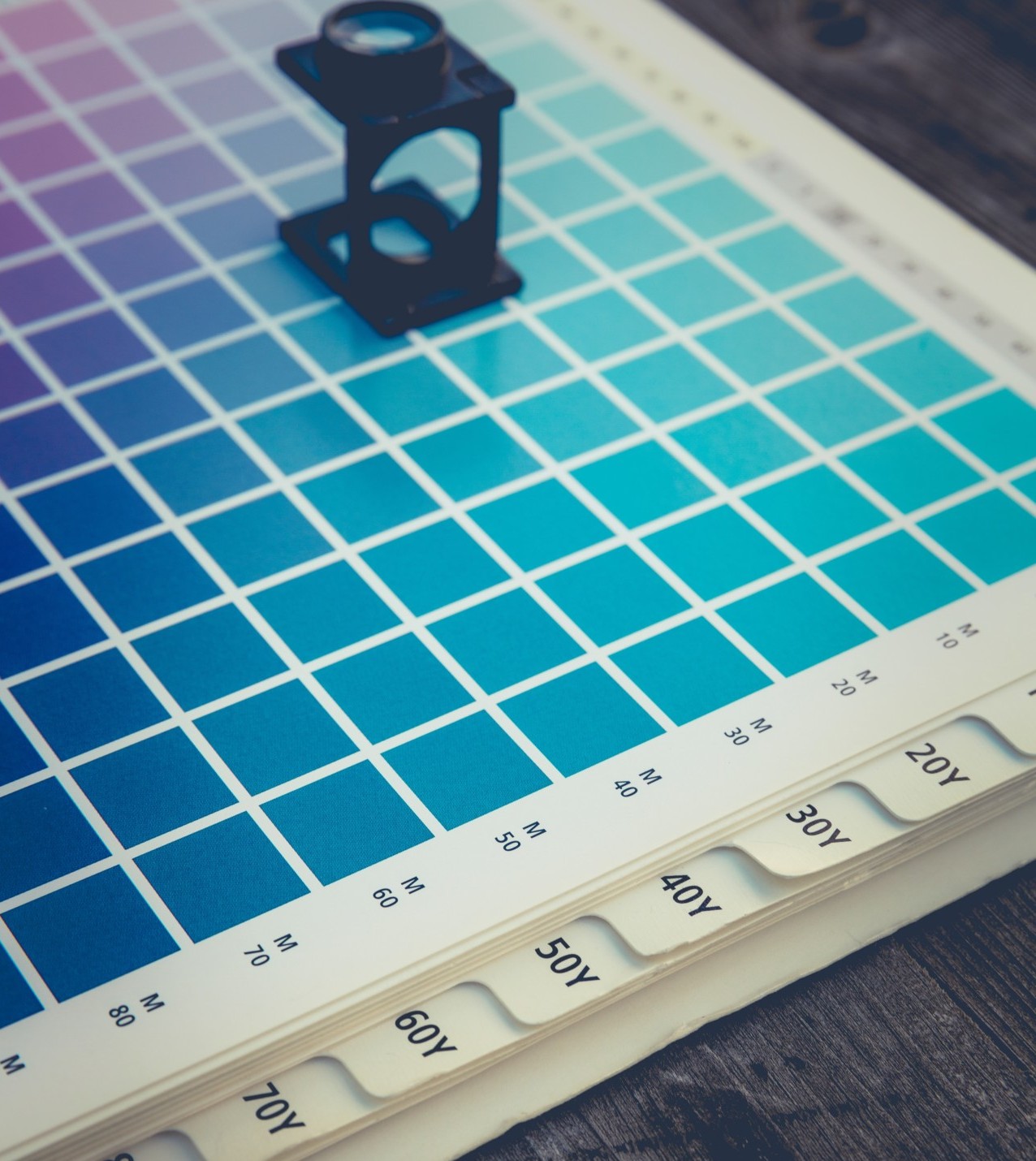
Collections include sample colors for an industry or company. These standard colors are issued so there’s a specific color used throughout the organization within set limits. Set collections help those in the organization describe color between locations and guarantee its uniformity. Collections range from a single color example for matching, or many thousands of colors for various products and usages.
Pantone® is a popular color collection. They’ve organized many color samples by substrate material and finish effects. Some include catalogs for inks, coatings, textile, paper, and plastic; with effect samples for coated, uncoated, metallic, or fluorescence.
Other collections include The Munsell Color System®, the German RAL® system (Reichs-Ausschuß für Lieferbedingungen), the NCS (Natural Color System®), the US Federal Standard 595, HKS®, Ostwald®, and ISCC-NBS.
Each collection has its limits. Physical samples can change over time due to exposure to light, heat, moisture, or chemicals. Because of this, the standards are only as good as their maintenance, and therefore subject to a range of variation. Define a policy to exchange your collections routinely or to perform inter-laboratory studies. This helps to ensure the proper color is always communicated to the customer.
Color by the Numbers: A Numerical Color Space
With the advent of the digital age, colorists benefited by the ability to gather numerical data to measure color. A colorimeter can illuminate an object and read the reflection (or transmission) of light wavelengths. When testing a hue for the first time, this value is “absolute value.” When you test against absolute value, you’ll measure the difference to this standard. By defining ranges of acceptance, you control reproducibility.
These numerical color spaces come from the idea that the human eye has cones for three colors: red, green, and blue. Discovered over 100 years ago, this receptiveness helped define color spaces. By varying the amount of red, green, and blue light, we can realize our eyes’ sensitivity to light stimulus for the three receptors.
This concept inspired the models based on tri-stimulus values. The values x-, y-, and z- describe the amount of red, green, and blue light reaching our eyes. Most numerical color spaces center on tri-stimulus values.
Once the eye has received the red, green, and blue light, our brain processes it. The Opponent Process Theory describes how the tri-stimulus values combine to produce other colors like yellow, black, and white. Through this, we know the brain processes three basic channels of color: black and white, red and green, blue and yellow.
We can graph these channels to produce a chart like this:
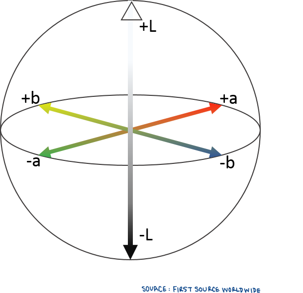
When plotted, a sphere helps us visualize all colors. You can see how three dimensions create the spectrum: black and white in the z-axis, red and green in the y-axis, and blue and yellow in the x-axis.
The three dimensions are generally assigned L- for lightness, a- for red/green and b- for blue/yellow.
With the tri-stimulus values graphed, we can get numbers that define where colors fall on the spectrum.
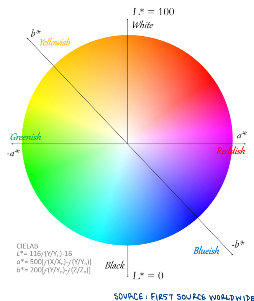
In 1948, Richard Hunter created this color map. He named it the Hunter Lab color space. It’s composed of difficult calculations, so it took time before colorists noticed Hunter’s color map seemed to compress yellow colors. Because of this, the values do not discern changes in color for yellows very well.
Color Defined by the CIE
The lack of yellow clarity in the Hunter color space led to the creation of other color maps by the International Commission on Illumination (CIE) in 1964 (CIEUVW) and 1976 (CIELUV, CIELCH, and CIELAB). The CIE derived other notable methods to describe color: through lightness, chromaticity (the distance from the center of the sphere), and hue angle (the angle of turn around the a/b axis).
L- = Lightness c- = Chromacity h- = Hue
These L-, c-, and h- parameters also define any color point in the sphere of tri-stimulus values.
This method was updated with other ways to calculate color difference in 1994 and 2000. The Society of Dyers and Colorists developed refinements to describe color differences in its Color Measurement Committee (CMC) also using the CIE parameters.
A Uniform Way to Communicate Color
There are many methods to communicate color to each other. If we want something “fire engine red,” we can describe it as Pantone® 1797C, a series of x-y-z values, Lab values, or maybe a color on a computer screen.
With each system, we must ensure we all look at the same color – that designer and colorist work in the same color space and share the same expectation.
Color is a human experience; as such, we must agree the color aligns with what is intended for the market.
Do you need help defining your color standards? Our Color Lab Manager is an expert at discovering the best color values for specific applications. Contact us today!
All trademarks, service marks, trade names, and product names within this article are the property of their respective owners. Any rights not expressly granted herein are reserved.